It's the hidden page!

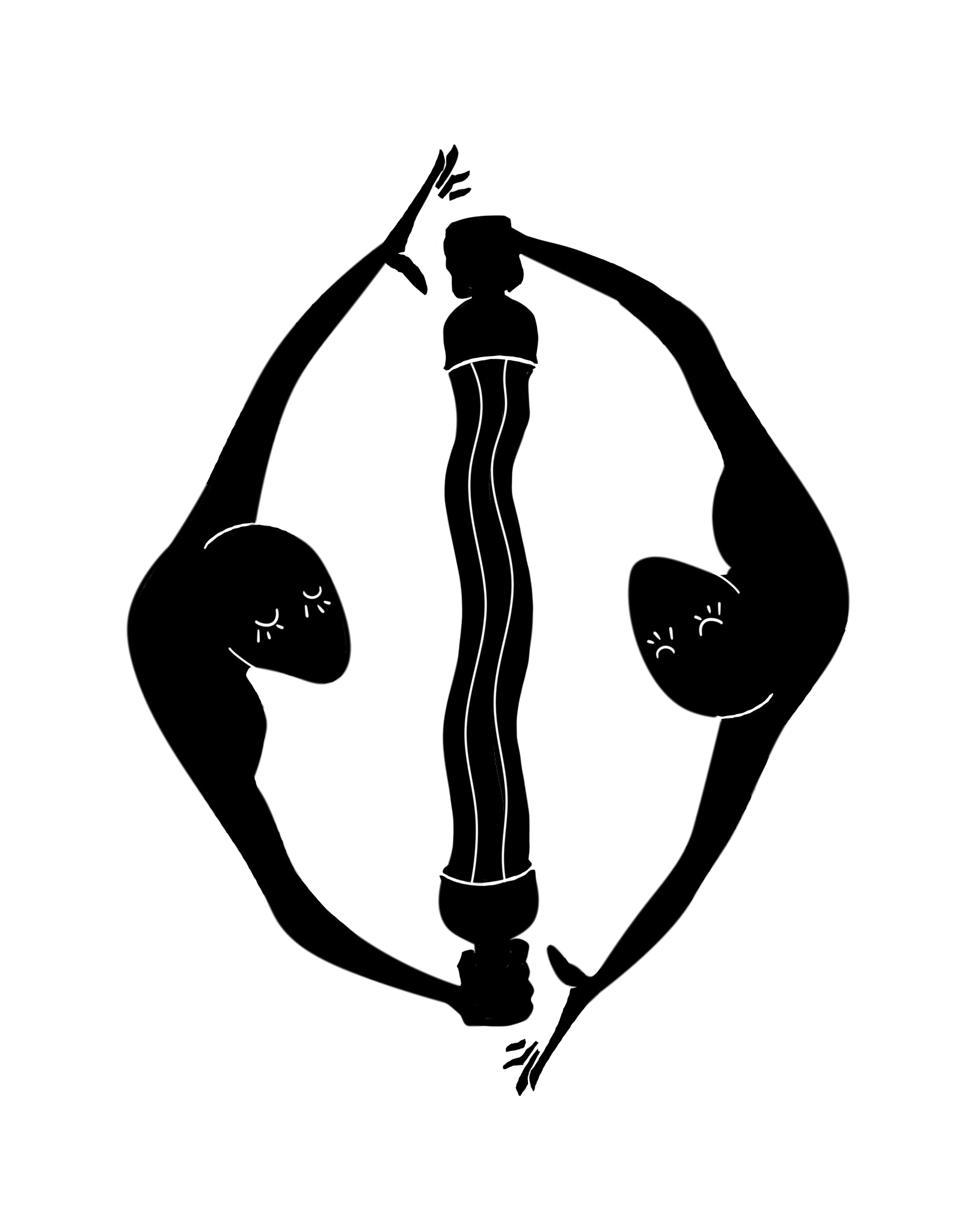
Here is the logo designed for a school project: the creation of a fictional publishing house! The logo was inspired by the representation of temperance as it is depicted on his major tarot card (Saint-Michel pouring water from one cup into another). From this idea emerges an impression of perpetual movement; first caused by the dynamics of the flow which seems infinite as it seems impossible to tell whether it rises or descends. It is then reinforced by the dance of two anonymous silhouettes who, without touching each other, share a bond that is both fragile and unstoppable. This movement illustrates the will of our fictional publishing house to sail "against the tide" by reconciling the irreconcilable, especially from a social and cultural point of view. Finally, the logo emphasizes on ideas of exchange and dialogue.